
Role of Colour in Custom Portraits – Impact on Emotion
Most people underestimate how profoundly colour shapes a portrait’s emotional impact, yet research shows over 60 percent of viewers can identify mood just by palette alone. In the world of British art, colour is more than decoration—it’s a vital storytelling tool that reveals hidden layers of personality and emotion. Here you’ll discover how colour choices in portraiture can transform a simple likeness into a richly expressive work that speaks to both artist and subject.
Table of Contents
- Defining Colour’s Influence In Portraits
- Colour Psychology And Emotional Resonance
- Popular Colour Styles In UK Portrait Art
- Choosing Colours For Family And Pets
- Common Colour Mistakes To Avoid
Key Takeaways
| Point | Details |
|---|---|
| Colour’s Emotional Language | Colour in portraits conveys complex emotional states, transforming simple images into powerful narratives. |
| Influence of Colour Psychology | Artists must consider colour choices carefully, as they can significantly affect the emotional resonance and storytelling of the artwork. |
| Balance in Colour Selection | Striking a balance between aesthetic appeal and emotional authenticity is crucial for effective portraiture. |
| Common Mistakes to Avoid | Common pitfalls include colour disharmony and failing to reflect the subject’s unique emotional essence, which can detract from the portrait’s impact. |
Defining Colour’s Influence in Portraits
Colour is far more than a visual element in custom portraits - it is a profound emotional language that communicates complex human experiences and psychological states. Each hue carries intrinsic emotional resonance, transforming a simple image into a powerful narrative about the subject’s inner world.
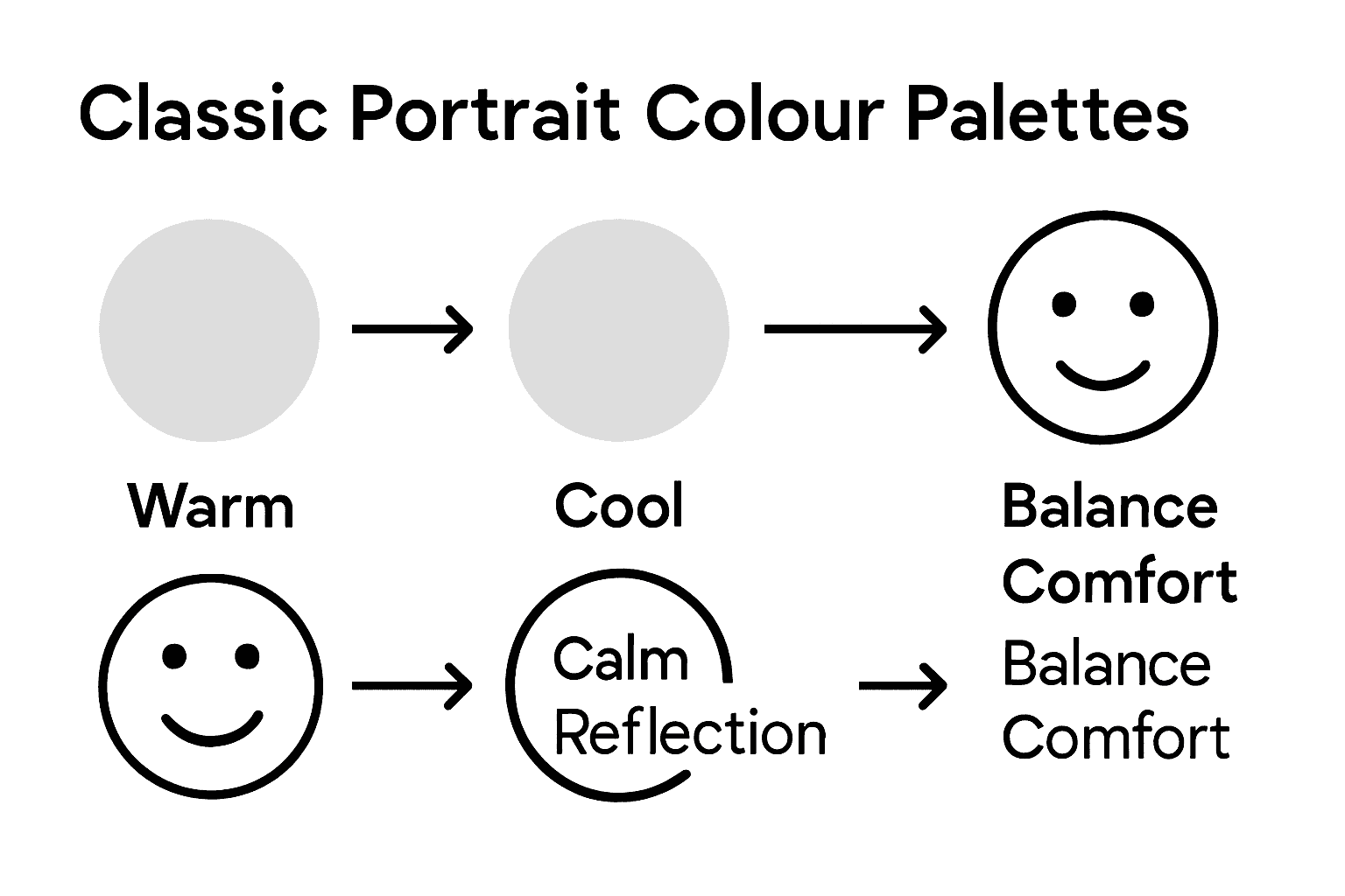
In portrait art, colour psychology plays a pivotal role in communicating mood and personality. Warm tones like reds and oranges can evoke passion, energy, and intimacy, while cooler blues and greens suggest tranquillity, reflection, and depth. Exploring fine art portraits reveals how masterful artists strategically employ colour to create emotional landscapes within a single frame.
The selection of colour palette is not merely aesthetic but deeply psychological. Soft pastel hues might represent vulnerability and gentleness, whereas saturated, bold colours can signify strength and confidence. Professional portrait artists understand that colour selection is a nuanced art form, carefully balancing visual harmony with emotional authenticity. Each chosen shade contributes to a comprehensive emotional narrative, revealing layers of personality beyond physical representation.
Pro Tip for Colour Selection: Choose portrait colours that authentically reflect the subject’s personality and emotional essence, considering their personal style, emotional temperament, and the story you wish to communicate through the artwork.
Here is a quick reference to how key colours influence emotional tone in portrait art:
| Colour | Typical Emotional Impact | Example Use in Portraiture |
|---|---|---|
| Red | Passion, energy | Expressing vibrancy or love |
| Blue | Calm, introspection | Creating a reflective mood |
| Green | Gratitude, growth | Symbolising renewal or hope |
| Orange | Warmth, enthusiasm | Conveying friendliness |
| Brown | Complexity, intensity | Adding emotional depth |
| Pastels | Gentleness, softness | Depicting innocence |
Colour Psychology and Emotional Resonance
Colour psychology represents a sophisticated language of emotional communication, transcending mere visual perception. A systematic investigation of conceptual colour associations reveals the profound ways different hues interact with human emotional landscapes, transforming portraits from simple images into powerful psychological narratives.
Research demonstrates that specific colours trigger distinct emotional responses. Warm colours like crimson and amber typically evoke passion and energy, while cool tones such as azure and sage communicate tranquillity and introspection. Emerging research using fuzzy emotion classification suggests intriguing emotional mappings - for instance, green potentially symbolises gratitude, whilst brown might represent more complex, intense emotional states.
In custom portraiture, understanding these nuanced colour interactions becomes crucial. Artists must navigate a delicate balance between aesthetic appeal and emotional authenticity. The chosen palette can communicate layers of personality, revealing inner complexities through strategic colour selection. Subtle shifts in saturation, brightness, and tone can dramatically alter the emotional resonance of a portrait, making colour selection a profound form of non-verbal storytelling.
Pro Tip for Emotional Colour Mapping: Experiment with colour combinations that authentically reflect the subject’s emotional depth, considering how subtle variations can profoundly transform the portrait’s psychological narrative.
Popular Colour Styles in UK Portrait Art
UK portrait art boasts a rich and nuanced colour tradition that reflects both cultural heritage and artistic innovation. Exploring the intricate relationships between painting media and colour manipulation reveals how different artistic techniques dramatically transform visual perception and emotional resonance in portraiture.
Traditional British portrait styles often embrace a sophisticated palette that balances restraint with emotional depth. Muted earth tones like sage green, dusty blue, and warm taupe have long been favoured, reflecting the understated elegance characteristic of British artistic sensibilities. The cultural history of colours illuminates how these colour choices are deeply rooted in historical and social contexts, transforming portraits from mere visual representations into complex narrative expressions.
Contemporary UK portrait artists are increasingly experimenting with bold colour techniques, challenging traditional boundaries. Techniques like unexpected colour juxtapositions, vibrant saturated hues, and unconventional colour gradients are becoming more prevalent. These innovative approaches allow artists to deconstruct traditional portraiture, offering more dynamic and psychologically nuanced representations that capture the subject’s inner complexity beyond conventional aesthetic norms.
Pro Tip for Colour Style Selection: Explore colour palettes that balance personal emotional narrative with artistic tradition, understanding that each colour choice communicates a unique psychological landscape.
Here is a comparison of traditional and contemporary colour approaches in UK portraiture:
| Aspect | Traditional Approaches | Contemporary Approaches |
|---|---|---|
| Palette Style | Muted earth tones | Bold, saturated hues |
| Emotional Expression | Subtle, restrained emotion | Dynamic, layered psychology |
| Technique | Gentle blending, harmony | Contrasts, unconventional blends |
| Narrative Effect | Understated, elegant storytelling | Disruptive, deeply personal |
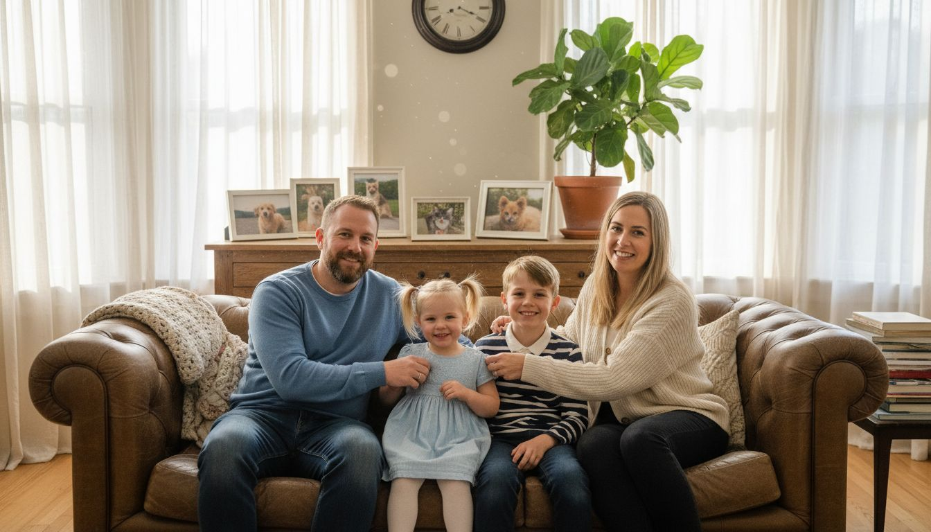
Choosing Colours for Family and Pets
Colour selection for family and pet portraits requires a delicate balance between personal connection and artistic expression. Insights from colour theory in portrait photography demonstrate how strategic colour choices can profoundly enhance emotional resonance and visual storytelling.
When selecting colours for family portraits, consider the unique personalities and emotional dynamics of each subject. Pets, with their distinctive fur tones and individual characters, offer fascinating colour opportunities. Art therapy research on emotional colour interactions reveals that certain colour palettes can evoke specific emotional responses, helping create portraits that capture deeper psychological nuances.
Different family members and pets have distinct colour personalities. Young children might be represented with soft, playful pastels, while mature family members could be complemented by richer, more sophisticated tones. Animal companions offer unique colour challenges - a golden retriever might inspire warm amber and honey tones, whereas a sleek black cat could suggest sophisticated charcoal and silver palettes. The key is harmonising individual colour characteristics while maintaining an overall cohesive visual narrative that represents the family’s unique emotional landscape.
Pro Tip for Family Portrait Colour Selection: Observe your family’s existing colour preferences and personal styles, using these insights as a foundational guide for creating a portrait palette that feels authentic and emotionally resonant.
Common Colour Mistakes to Avoid
Colour selection in portraiture demands careful consideration, as seemingly minor choices can significantly impact the emotional impact of the artwork. Psychological studies on background colour effects reveal how subtle colour decisions can dramatically alter the viewer’s perception and emotional response.
One of the most prevalent mistakes is creating colour disharmony by selecting shades that clash rather than complement each other. Research into colour aesthetics demonstrates that inappropriate colour combinations can diminish the overall visual quality of a portrait. Common pitfalls include using overly saturated colours that compete for attention, selecting backgrounds that overwhelm the subject, or choosing palettes that fail to capture the subject’s unique emotional essence.
Artists and photographers often make critical errors by neglecting the subtle nuances of colour temperature and emotional resonance. Monochromatic colour schemes can feel flat and lifeless, while excessively complex colour palettes can create visual confusion. The most effective portraits strike a delicate balance, using colours that enhance the subject’s natural tones and personality. This requires a deep understanding of how different hues interact, how they reflect light, and how they communicate emotional subtleties unique to each individual or pet.
Pro Tip for Colour Harmony: Always create a colour test palette before finalising your portrait, experimenting with different combinations to ensure they authentically represent the subject’s emotional landscape.
Bring Emotion to Life with Colour in Your Custom Portraits
Understanding how colour influences emotion is key when capturing the true essence of your loved ones and pets. This article highlights common challenges like selecting the right palette to reflect personality and emotional depth without clashing or overwhelming. At The Family Portrait Company we specialise in custom portraits that thoughtfully use colour psychology to reveal your family’s unique story in every brushstroke.
Discover how our artists blend warm and cool tones, subtle pastels and rich hues to create harmonious portraits that resonate emotionally and visually. Our expert approach avoids common mistakes such as colour disharmony or flatness, ensuring your portrait becomes a powerful narrative of passion, calm or warmth. See how easy it is to transform your photos into a timeless artwork that truly speaks to your heart.
Explore our full range of Custom Pet and Human Portraits to start creating a visually stunning and emotionally authentic portrait today.
Bring colour psychology and emotional resonance into your home now. Visit The Family Portrait Company to commission your bespoke portrait and let our artists craft a masterpiece that reflects your family’s soul with every shade and tone.
Frequently Asked Questions
What is the impact of colour in custom portraits?
Colour in custom portraits significantly influences emotional communication and can transform an image into a narrative that reveals the subject’s inner feelings and personality traits.
How do warm and cool colours affect the mood of a portrait?
Warm colours like red and orange typically evoke feelings of passion and energy, while cool colours such as blue and green suggest calmness and introspection. This choice significantly impacts the overall mood of the portrait.
What are some common colour mistakes to avoid when creating a portrait?
Common mistakes include selecting clashing colours that cause disharmony, using overly saturated colours that may compete for attention, and neglecting subtle colour nuances that can affect emotional resonance in the artwork.
How should I choose colours for family and pet portraits?
When choosing colours for family and pet portraits, consider the individual personalities and emotional dynamics of each subject. Harmonising different colour characteristics while maintaining a cohesive visual narrative is key to capturing the family’s unique emotional essence.
Recommended
- Why Choose Custom Portraits: Understanding Their Value – The Family Portrait Companys
- Understanding the Benefits of Custom Portraits – The Family Portrait Companys
- Understanding the Custom Portrait Creation Process – The Family Portrait Companys
- Role of Artists in Custom Portraits: Complete Guide – The Family Portrait Companys